書体
- 書体名: Gemini。販売元によって Gemini Computer、Automation、Sonic などの名前がある12
- ファウンドリ: Filmotype(Gemini)、Conways(Gemini Computer)、Solotype・Formatt(Automation)など1。日本ではモンセン・タイポグラファーズ(シカゴ)の写植として紹介された3
- 種類: 写植書体、レタリングシートなど1
- デザイナー: Franco Grignani(もとの字)45
- 年: 1966年(もとの字は1964年。下記で説明)
もとになったのは、イタリアのグラフィックデザイナー Franco Grignani が1964年に描いた「Magnetic」という字。Grignani は、1984年の文章(展覧会のポスターに刷られた「Type: una lezione di graphic design di Franco Grignani」)で、IBM の磁気インクで印刷された数字に着想を得て描き、読みにくいのではないかと迷いながらも『Pubblicità in Italia 1964-1965』(イタリアの広告年鑑)の表紙に使ったこと、1966年にこの字が米国で写植に移されて、未来的な見出しに数多く使われたことを述べている4。
Quando nel 1964 disegnai per la prima volta il carattere “Magnetic” ispirato ai numeri IBM, stampati con inchiostri magnetici, ebbi il dubbio della poca leggibilità (per quanto io li avessi usati per la copertina di “Pubblicità in Italia 1964-1965) ma nel 1966 questi caratteri furono ripresi in America e trasferiti in fotocomposizione
その扉には、Grignani 本人が「1964年にこの文字列を組むためだけに描いた。米国で字が写し取られ、1966年に出た」と書き込んでいる5。
米国で写植にした会社と、Gemini という名前の由来は、どの資料にも書かれていない。Fonts In Use が挙げる見本帳は、1973年の Typeshop(デュッセルドルフ)、1974年ごろの Filmotype などで1、日本では1970年10月の『レタリング&タイポグラフィ』創刊号に見本が載っている6。『アーケードゲーム・タイポグラフィ』は、デザイナー不明、1965年ごろの書体としている2。
デザイナー
Franco Grignani(1908〜1999年)は、イタリアの建築家・デザイナー・画家。パヴィア県の Pieve Porto Morone に生まれ、トリノ工科大学で建築を学んだ。ゲシュタルト心理学の知見を使った視覚伝達の研究で知られる78。1964年の羊毛の品質マーク(ウールマーク)のロゴも Grignani のデザイン8。
字形
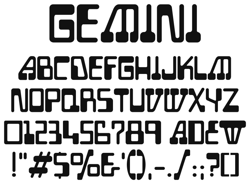
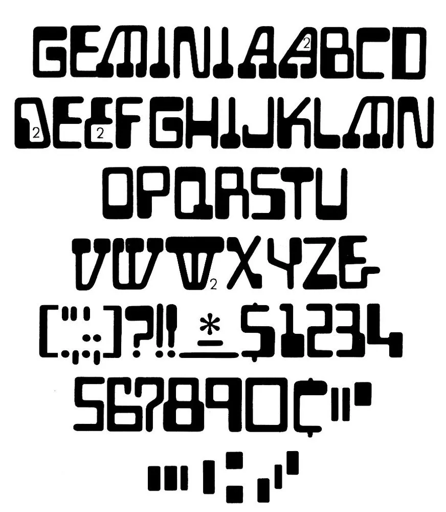
数字は E-13B(小切手の番号などを機械で読み取る磁気インク文字認識のための書体)に近い形で、E-13B の4つの記号(小切手の番号の区切りなどに使う記号)もある。M は独特の形で、A・D・E・W には別の字形がある9。
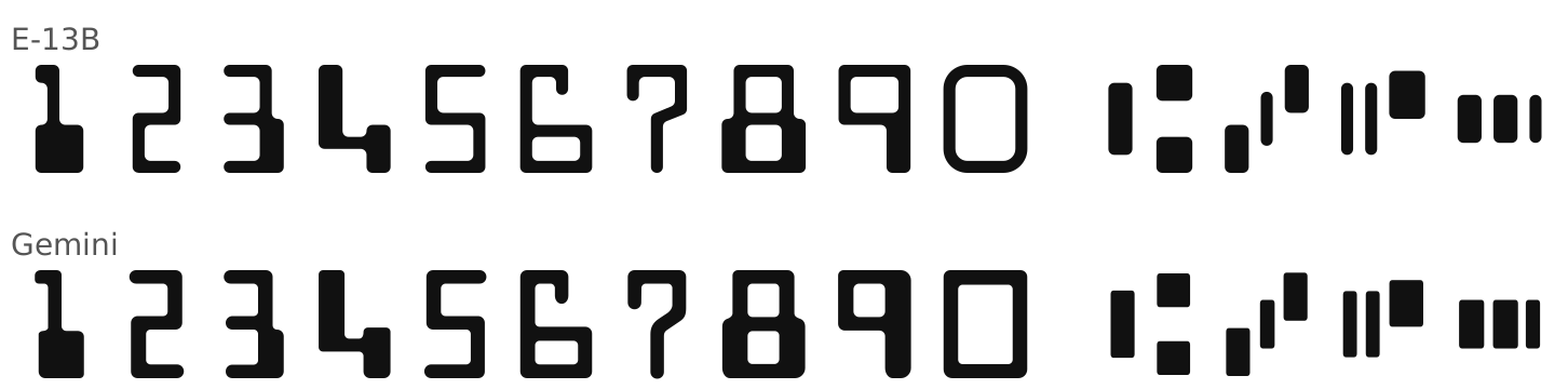
数字と記号は E-13B とほぼ同じ形で、0(ゼロ)だけが角張っている。
Fonts In Use は、Westminster と並んで、MICR の数字の形を英字に当てはめた最初の書体としている。Grignani の Magnetic とは、A の下が閉じている、E の線の太さがそろっている、G が簡単な形、数字が独自の形、などの違いがある。W は Gemini の別の字形の W と同じ形1。
日本での紹介
1970年10月の『レタリング&タイポグラフィ』創刊号の記事「コンピューター文字」は、Moore Computer・Amelia と並べて Gemini の見本を載せ、キャプションを「コンピュータースタイルの写植書体GEMINI」としている。本文では Gemini には触れていない6。
1972年の桑山弥三郎 編著『グラフィック・エレメント集 6 装飾アルファベット』は、「モダン・スタイル」の分類に、No.125「モア・コンピューター」(Moore Computer、146ページ)、No.126「ゲミニ」(Gemini、147ページ)、No.127「ハウストン」(Houston、148ページ。字の形は Westminster と同じ)を続けて載せている。ゲミニはシカゴのモンセン・タイポグラファーズの写植書体とし、「数字は前頁のもの〔編注:モア・コンピューター〕と似ているが,アルファベットはかなり字体が違う」と説明している3。
モンセン タイポグラファーズ編『モンセン・スタンダード欧文書体清刷集 1』(嶋田出版。著作権表示は1979年)は、「GEMINI COMPUTER」の名で、99ページに全字の見本を載せている。A・D・E・W の別の字形と、E-13B の4つの記号も入っている10。
『欧文書体集1488』(1991年)は、分類別の索引で Gemini を「COMPUTER」に入れ(ほかに Amelia・Cucumber・LED・Moore Computer)、183ページに全字の見本を載せている911。
大曲都市『アーケードゲーム・タイポグラフィ』(2020年)は、MICR のテイストを取り入れた書体として Westminster と Data 70 を紹介したあと、Moore Computer・Orbit-B と並べて Gemini を挙げ、これらが「相次いで発売された」としている2。
デジタルフォント
Fonts In Use によると、デジタル版には Type Revivals(Tim Ryan)の Automation(1990年代)もあり、大文字には輪郭線の字と影付きの字も入っていた112。ロサンゼルスの Soft Horizons(John Desrosiers)の Otto Mason SH も、Automation をデジタル化したもの13。
BD Geminis
スイス・ベルンの Büro Destruct(Heinz Reber)が作ったフォント。フォントの情報では2003年、Fonts In Use は2009年とする1。フォントの説明には、Letraset の Gemini と、Mattel Electronics の古いロゴをもとにしたとある。0(ゼロ)には斜線があり、4・7・8 などの数字は E-13B と形が異なる。小文字の位置に、A・C・D・E・H・M・O・V・W・X の別の字形が入っている14。Adobe Fonts で使えるほか、Büro Destruct のサイト Typedifferent でも配布している1415。
Auto Mission
Toto が2011年に作ったフォント。Dan Solo の見本帳『Special Effects and Topical Alphabets』の Automation Shaded をもとにしている16。abfonts(ニュースグループ alt.binaries.fonts に投稿されたフォントの保管サイト)で、個人の利用に限って無料で配布している17。
Toto の投稿によると、Solo の見本帳には A・D・E に別の字形があり、Otto Mason SH は別の字形のほうだけを入れていた。Auto Mission は、Otto Mason SH にない形の A を大文字に、D・E を小文字に入れた。B・T は大文字と小文字で少し異なる形にし、W は大文字に見本帳の形を入れた。L・O・S・U・V・Y は、この書体が使われたアンプの前面パネルの写真をもとに、別の字形を大文字に足した。L・U はほかの MICR 風の書体から来たのかもしれない、としている17。
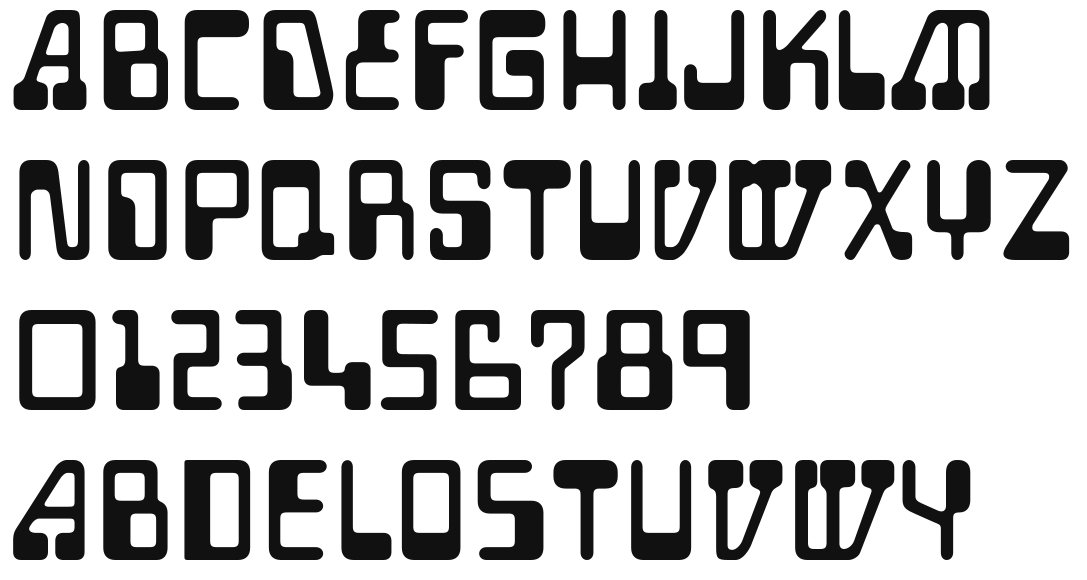
Atwin
イギリスの Cubic Type(David Jones)が2021年に出したフォント1。名前は「A twin」(ふたご=Gemini)のしゃれ18。フォントの説明に「A digital interpretation of Gemini」とあり、デザイナーの欄に David Jones と Franco Grignani の名前がある。A(2種類)・D・E(2種類)・G・N・O・P・S・U・V・W の別の字形が入っている19。MyFonts で販売している19。
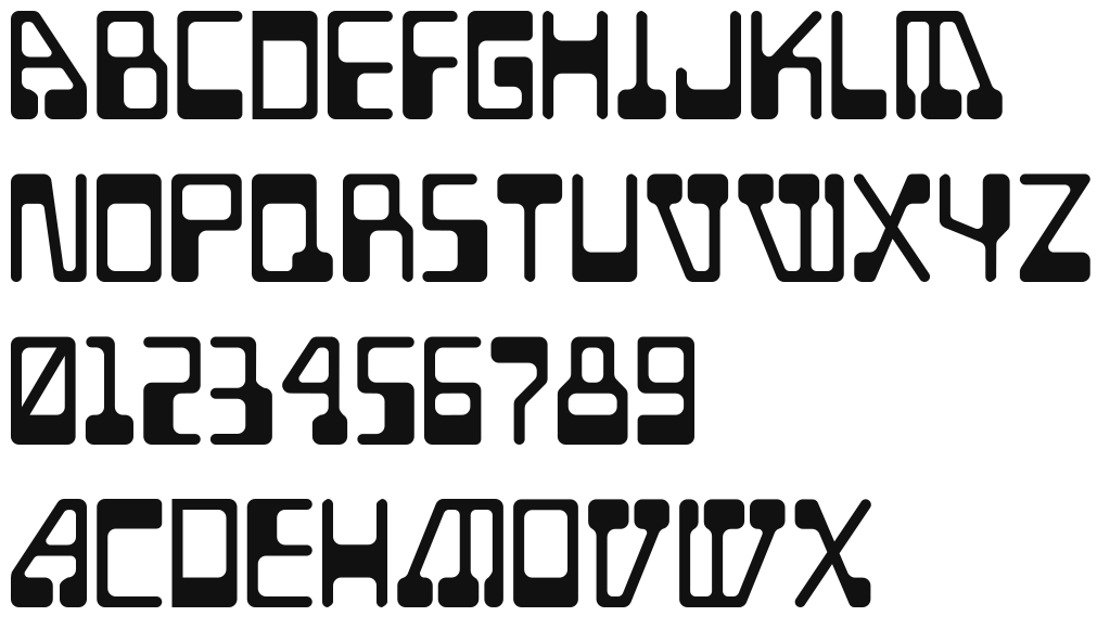
3つのうち、『欧文書体集1488』の見本と字の形が最も近いのは Atwin で、見本の A・D・E・W の別の字形も Atwin の別の字形と同じ形。
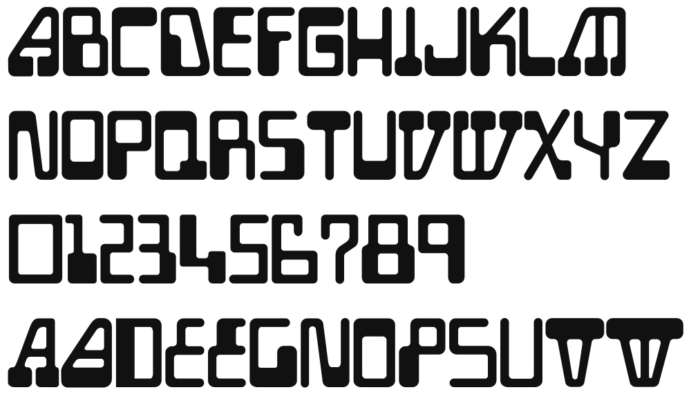
3つのデジタルフォントの比較
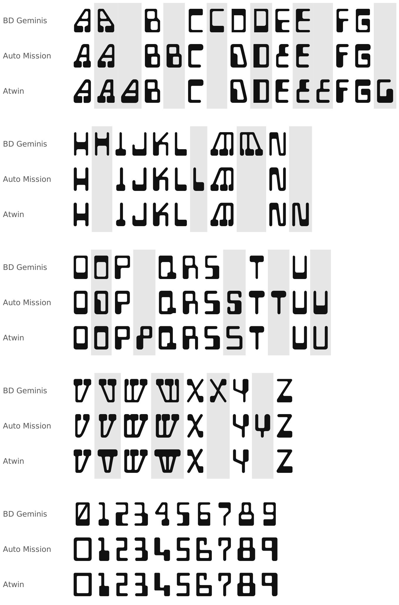
使用例
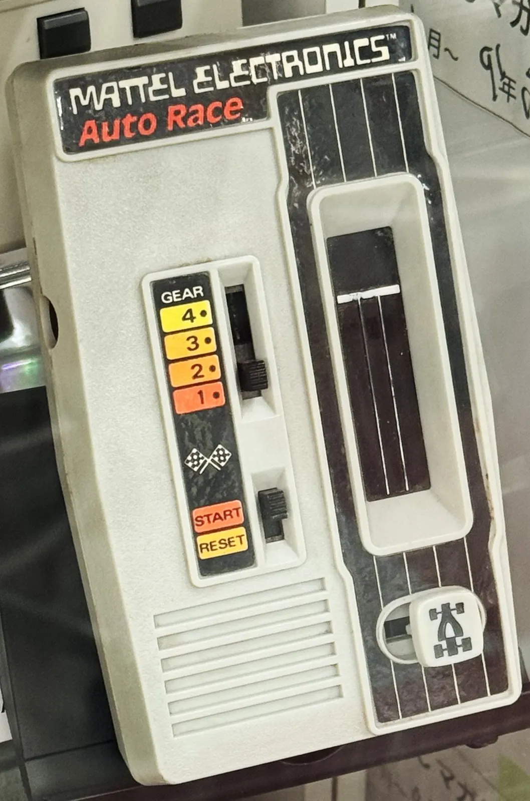
マテル「オートレース」(1976年)。「MATTEL ELECTRONICS」は一部の字が Gemini と異なる20。日本でも1970年代後半に輸入販売された21。マイコン博物館(東京都青梅市)の展示。
参考資料
グラフィック・エレメント集 6 装飾アルファベット
ファンシー・イニシャル・人文字書など
著者 - 桑山弥三郎 編著
出版社 - 柏書房
出版年 - 1972年
「モダン・スタイル」の分類に「ゲミニ」(No.126、147ページ)。シカゴのモンセン・タイポグラファーズの写植書体として見本と解説。前の No.125 は「モア・コンピューター」、次の No.127 は「ハウストン」。
モンセン・スタンダード欧文書体清刷集 1
著者 - モンセンタイポグラファーズ
出版社 - 嶋田出版
出版年 - 1990年6月
ISBN - 4915054616
書体見本(p.99)。書体名は「GEMINI COMPUTER」(索引の No.99)。大文字(A・D・E・W に別の字形)、$・1〜9・0・¢、E-13B の4つの記号、括弧・約物。1990年6月の改訂第4版第4刷で確認(著作権表示は1979年)。
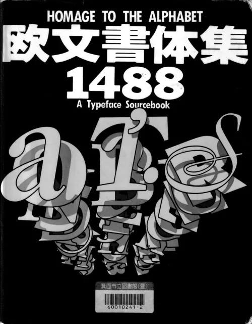
欧文書体集1488
Homage to the Alphabet: A Typeface Sourcebook
著者 - Phil's Photo
出版社 - オーク出版サービス
出版年 - 1991年1月10日
ISBN - 4872460340
書体見本のみ掲載(p.183)。書体名は「GEMINI」。大文字・数字・記号。E-13B に近い形の数字と、E-13B の4つの記号あり。分類別索引(CI-51)では「COMPUTER」に分類。デザイナー・年の記載なし。

文字とタイポグラフィの地平
著者 - 誠文堂新光社
出版社 - 誠文堂新光社
出版年 - 2015年11月
ISBN - 9784416115480
『レタリング&タイポグラフィ』の各号を紹介した本。創刊号(1970年10月)の記事「コンピューター文字」の誌面を再録(p.250)。「コンピュータースタイルの写植書体GEMINI」として見本。
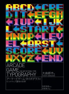
アーケードゲーム・タイポグラフィ
ビットマップ書体の世界
著者 - 大曲, 都市
出版社 - グラフィック社
出版年 - 2020年1月
ISBN - 9784766133196
解説(p.130、「MICR(磁気インク認識)書体」の章の扉)。別名(Automation、Gemini Computer、Sonic)と、デザイナー不明・1965年ごろと書く。
リンク
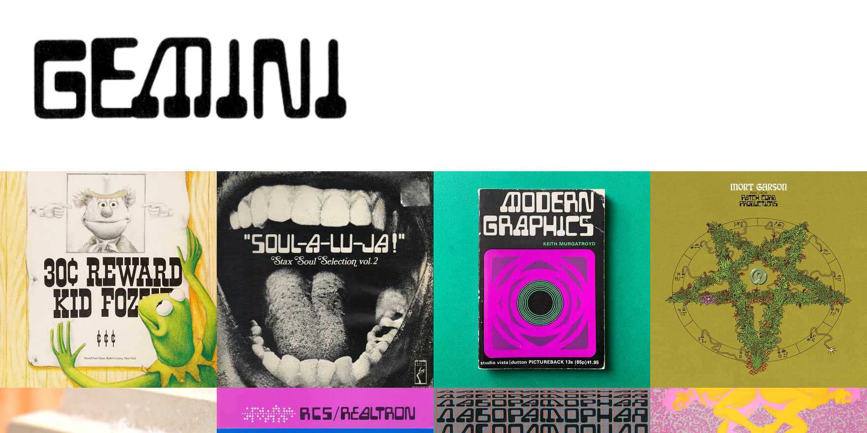
Gemini Computer in use
Together with Westminster, Gemini was the first typeface design to apply the idiosyncratic forms of machine-readable magnetic ink numerals (see MICR) to letters. Designed by Franco Grignani in 1964 with the title Magnetic and used in his work in 1965. This custom alphabet was subesquently adopted for photocomposition in 1966 in America. [Grignani] Available from phototype firms under various names, (first?) as Gemini by Filmotype [Typeshop 1973] [Filmomaster c.1974], as Gemini Computer [Conways 1974], Automation [Solo 1978] [Formatt 1974], and as Sonic (by whom?). See also Westminster, Computer and Data 70. Digital interpretations include Automation (Type Revivals, 1990s, w/ open and shaded glyphs in the uppercase), BD Geminis (Büro Destruct, 2009), Auto Mission (Toto, 2011; based on the Solotype showing, and Atwin (Cubic Type, 2021).
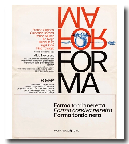
Forma vs Helvetica – Franco Grignani
In 1965 the Nebiolo foundry management set up a research committee of graphic designers to sit beside Aldo Novarese. A working group of eight prominent figures from Milan’s graphic design scene (including Franco Grignani) was set up to collaborate on new typefaces.

Gemini (AKA Gemini Computer or Sonic)
From Phil’s Photo: Homage to the Alphabet, 1980. Designer and date unknown (circa 1970). Like Computer and Data 70, Gemini is an alphabetic extension of the MICR aesthetic, but more wonky than those other interpretations. Mattel Electronics tamed it for their logo. Gemini at Fonts In Use »
BD Geminis from Buro Destruct
Explore BD Geminis designed by Lopetz at Adobe Fonts.
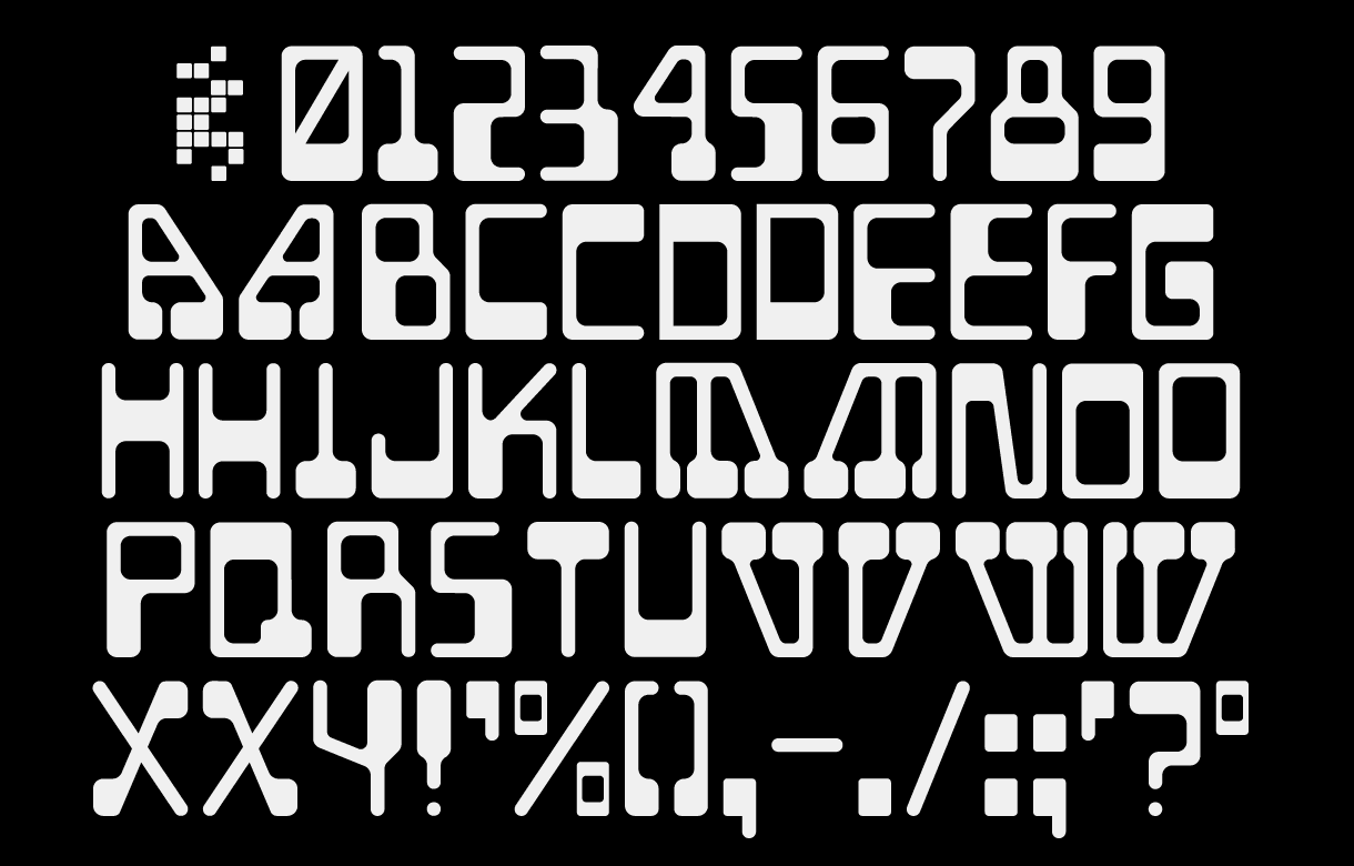
Typedifferent - BD Geminis
BD Geminis is an interpretation of several typeface variants used mainly in the 1970s and 1980s for sci-fi and technology related products. Updated with all latin characters and additional glyphs in 2024.
Auto Mission by Toto || abfonts - alt.binaries.fonts
Auto Mission by Toto is a digitization of the computer type font Automation
Atwin Font | Webfont & Desktop | MyFonts
Atwin is a modern remake of Franco Grignani’s Gemini. It is inspired by the unusual forms of the MICR numbers on bank cheques.Strangely rounded rectangles make the glyphs appear unfamiliar; an angular but also blobby design that disrupts and breaks away from tradition.Good in display sizes. You should use Atwin to add

D Jones / font-atwin · GitLab
GitLab.com
出典・注
-
Fonts In Use「Gemini Computer」(2026年9月27日閲覧。「Designed by Franco Grignani in 1964 with the title Magnetic and used in his work in 1965. This custom alphabet was subesquently adopted for photocomposition in 1966 in America.」) ↩ ↩2 ↩3 ↩4 ↩5 ↩6 ↩7 ↩8
-
大曲都市『アーケードゲーム・タイポグラフィ ビットマップ書体の世界』(井原恵子 訳、グラフィック社、2020年)130ページ ↩ ↩2 ↩3
-
桑山弥三郎 編著『グラフィック・エレメント集 6 装飾アルファベット』柏書房、1972年、146〜148ページ(No.125〜127)と解説 ↩ ↩2
-
Franco Grignani「Type: una lezione di graphic design di Franco Grignani」ミラノ、1984年3月15日(ポスター。デザイン Heinz Waibl)。AIAP CDPG の旧サイトの Fondo Franco Grignani の所蔵目録「Type: una lezione di graphic design di Franco Grignani, Milano 1984」(FFG-ARma025)に本文の書き起こし(2026年10月14日閲覧) ↩ ↩2 ↩3
-
『Pubblicità in Italia 1964-1965』(Editrice l’Ufficio Moderno)の扉への Franco Grignani の書き込み(「Disegnato nel 1964 SOLO per comporre questa scritta. In America, ricopiando i caratteri è uscito nel 1966」)。遺族(孫の Emiliano Camera Grignani 氏)によるサイト francogrignani.info の「Forma vs Helvetica」に画像(2026年10月13日閲覧) ↩ ↩2
-
「コンピューター文字」『レタリング&タイポグラフィ』創刊号、日本レタリングデザイナー協会、1970年10月。誌面はアイデア編集部編『文字とタイポグラフィの地平』(誠文堂新光社、2015年)250ページに再録 ↩ ↩2
-
「Grignani, Franco」Enciclopedia Treccani(2026年10月14日閲覧。「Architetto, designer, pittore italiano (Pieve Porto Morone 1908 - Milano 1999).」「utilizzando in modo intuitivo e concreto i fattori di organizzazione psicologico-strutturale studiati dalla Gestalt」) ↩
-
「Fondo Franco Grignani」AIAP CDPG(2026年10月14日閲覧。「si laurea in Architettura al Politecnico di Torino」「il progetto per il marchio della pura lana vergine (International Wool Society) realizzato nel 1964」)。AIAP はイタリアのビジュアルコミュニケーションデザインの職能団体、CDPG はその資料館 ↩ ↩2
-
モンセン タイポグラファーズ編『モンセン・スタンダード欧文書体清刷集 1』嶋田出版、1990年(改訂第4版第4刷)、99ページ ↩
-
『欧文書体集1488』オーク出版サービス、1991年、分類別索引 CI-51 ↩
-
Luc Devroye「Tim Ryan」(2026年10月14日閲覧。Type Revivals の書体一覧に「AutomationTR」) ↩
-
Luc Devroye「MICR fonts」の K22 Fonts の項(2026年10月14日閲覧。「Auto Mission … is more complete than Otto Mason SH, the Soft Horizon digitization of Automation」) ↩
-
「BD Geminis」Typedifferent(Büro Destruct。2026年10月13日閲覧)。フォントファイル(Version 2.000)の name テーブル(「BD Geminis: 2003」「inspired by an old lettraset font called Gemini and a an old mattel electronics logo」) ↩ ↩2
-
「BD Geminis」Adobe Fonts(2026年10月14日閲覧) ↩
-
フォントファイル「Auto Mission.otf」(Version 1.0)の name テーブル(「©Toto 2011」「Derived from Automation Shaded on page 3 of Dan Solo’s Special Effects and Topical Alphabets.」「This font is free for personal use.」) ↩
-
「Auto Mission by Toto」abfonts(2011年9月22日の alt.binaries.fonts への Toto の投稿。2026年10月14日閲覧。「Three alternates (A, D amd E) in the Solo book were not included in Otto Mason SH (aka Automation), the Soft Horizon digitization of Automation.」「I also added slightly different B and T in the uppercase, and a W in the uppercase as it appeared in the Solo book. Also added alternates for L, O, S, U, V and Y based on an image of an amplifier faceplate where the font is used」) ↩ ↩2
-
David Jones「font-atwin」GitLab の README(2026年10月14日閲覧。「Atwin is a digitisation of Franco Grignani’s Gemini.」「The name Atwin is a pun: “A twin” = Gemini, the twin of the zodiac.」) ↩
-
「Atwin」MyFonts(Cubic Type、David Jones。2026年10月13日閲覧)。フォントファイル(Version 3.235)の name テーブル(「A digital interpretation of Gemini. Made in Yorkshire by David Jones.」、デザイナー「David Jones; Franco Grignani」) ↩ ↩2
-
Fonts In Use「Mattel Electronics Portable Electronic Games」(2026年10月14日閲覧。書体に「Gemini Computer (with customized letters)」) ↩
-
『電子ゲームなつかしブック』(コアムックシリーズ No.682)、17ページ(「マテル(1976年発売)」「1970年代後半に日本でも「ゲームシンジケート」シリーズとして、本作を含む7種類がアメリカから輸入販売されている」) ↩