
書体
- 書体名: Magnetic Ink(Mecanorma 版は Magnetic)1
- ファウンドリ: Photo-Lettering(ニューヨーク)2、Mecanorma(フランス)13
- 種類: 写植書体(Photo-Lettering)、ドライトランスファーのレタリングシート(Mecanorma)1
- デザイナー: 不明(Moore Computer を Photo-Lettering が作り直したもの)1
- 年: 1969年までに(下記で説明)
Fonts In Use によると、Photo-Lettering が Moore Computer(VGC、1968年)を作り直した書体で、1969年にはすでに使われている1。
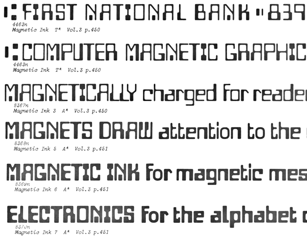
1971年の Photo-Lettering の見本帳『Photo-Lettering’s One Line Manual of Styles』は、「COMPUTER AND MAGNETIC INK STYLES」の見出しの下に、大文字のみの「Magnetic Ink」(4463)と、小文字のある「Magnetic Ink 3」(8367)、より太い「Magnetic Ink 5」「6」「7」(8368〜8370)を載せている。Magnetic Ink には「T*」(既存の書体かそれに相当するもの)、3・5・6・7 には「A*」(Photo-Lettering が手描きで書体に加えたもの)の印がある4。ただし Magnetic Ink の字形は、Moore Computer とは異なるところが多い(下記「字形」)。Moore Computer は大文字のみの書体だが、Photo-Lettering は小文字を描き足し、太さの異なるものを加えて、Magnetic Ink・3・5・6・7 の5種類にした。
Mecanorma は、Photo-Lettering から使用の許諾を受けて、大文字のみの元のスタイルを「Magnetic」の名でレタリングシートにした1。1971年1月のオランダの雑誌『Ariadne』の Letter-Press(Mecanorma のブランド)の広告に、「148 MAGNETIC」として載っている5。Mecanorma の1988年の見本帳『Mecanorma Graphic Book 14』にも、大文字・数字・記号の見本があり、「P.L.I.」(Photo-Lettering Inc.)と記されている。同じ見本帳の索引では「ファンシー」に分類されている6。
字形
Fonts In Use によると、Moore Computer との違いは、O の線の太さが一定であること、I の上下が太いこと、V の左側がまっすぐであること(V が左右に反転した形)1。Mecanorma の見本帳を Moore Computer と比べると、ほかにも違いが多い。Q の尾が下に突き出ない、W の上と 0(ゼロ)の中の浮いた四角がない、X の下が太い、5 の右下が太くない、など。字幅も全体に広い6。
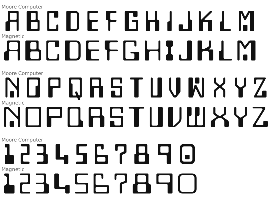
この図の Moore Computer は、デジタルフォントの Computer で示している。Computer は、『欧文書体集1488』(1991年)の写植の Moore Computer の見本と字の形も字幅もほぼ一致するので、写植の Moore Computer との比較として見られる7。
デジタルフォント
Fonts In Use は、デジタル版は知られていない、としている1。
参考資料
Mecanorma Graphic Book 14
日本語版(Version japonaise)
著者 - Mecanorma
出版社 - Mecanorma International
出版年 - 1988年
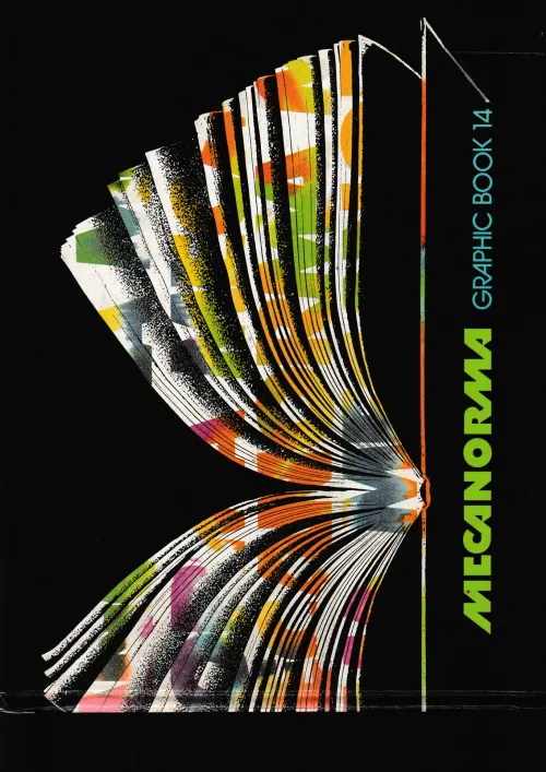
書体見本のみ掲載(p.157)。「Magnetic」の大文字・数字・記号と、10mm(148.36 CN)・5mm(148.20 CN)の2つの大きさ。「P.L.I.」と記載。「レタープレスシート」の書体の索引(p.44)では「ファンシー」に分類。日本語版(奥付に「Version japonaise」「DLB - 29261-1988」)。
欧文書体集1488
Homage to the Alphabet: A Typeface Sourcebook
著者 - Phil's Photo
出版社 - オーク出版サービス
出版年 - 1991年1月10日
ISBN - 4872460340
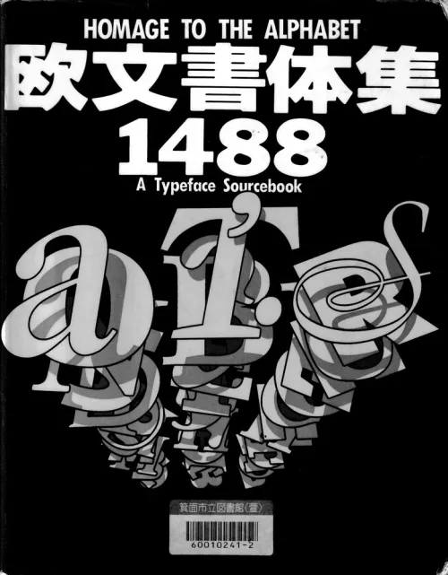
Moore Computer の書体見本(p.262)。字形の比較で、デジタルフォント Computer と写植の Moore Computer がほぼ一致することの確認に使った。
リンク
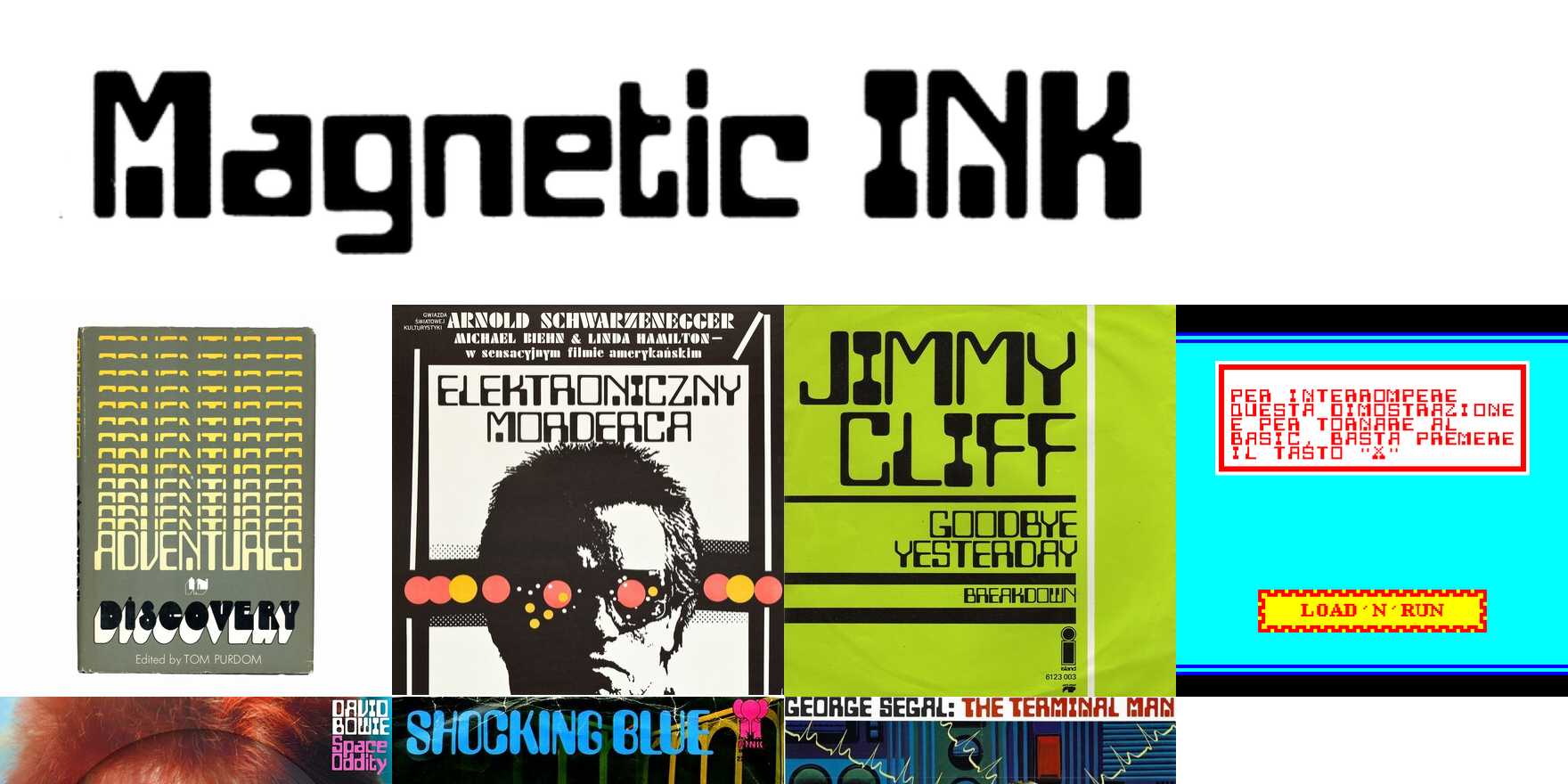
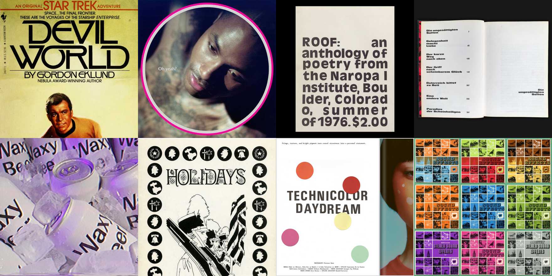
Magnetic Ink in use
Magnetic Ink is Photo-Lettering’s adaptation of Moore Computer (#4463), distinguished by an unmodulated ‘O’, an ‘I’ with thick top and bottom, and a ‘V’ with a straight left side. Already used in 1969. Later extended with a lowercase (#8367) and three bolder weights, 5–7 (#8368–8370). [PLINC One Liner 1971] The sample shows Magnetic Ink 6. The original caps-only style was licensed to Mecanorma who sold their adaptation for dry transfer lettering as Magnetic. [1971 ad] No known digitization.

Photo-Lettering
Founded by Ed Rondthaler. “One of the earliest and most successful type houses to utilize photo technology in … typography and lettering. PLINC [Photo-Lettering, Inc.] … was a mainstay of the advertising and design industry in New York City from 1936 to 1997. ” — House Industries, who purchased the assets in 2003. Produced many of ITC’s predigital fonts. In 2011, House Industries relaunched Photo-Lettering as a web service that emulated the original experience of ordering one-off settings of display type for the digital age, initially with a selection of 40 digitized typefaces, some with special features like alternates and layers for chromatic settings. The final product was a downloadable vector-based file. By 2021, the style count had about doubled in size, and also included new designs that didn’t originate with the original PLINC. After the web service was discontinued around 2022, some of the digitized typefaces were made available for standard licensing from House Industries.
Mecanorma
Mecanorma was a manufacturer of dry transfer lettering based in France. They produced original typefaces in addition to licensing designs from other foundries. Their product line for typefaces was named Normatype in the US and Letter-Press elsewhere. Joined the French Revillon group in 1979. In 1984, there were production plants in Tours, Perray-en-Yvelines, and the Dutch town of Sassenheim (Mecanorma Polyvroom N.V., 1968–1989). [Mecanorma 1984] The company abandoned the graphic art market in the 1990s. Rights to the Mecanorma Collection were claimed by ITF and, as of 2024, by The Type Founders.
出典・注
-
Fonts In Use「Magnetic Ink」(2026年10月14日閲覧。「Magnetic Ink is Photo-Lettering’s adaptation of Moore Computer (#4463), distinguished by an unmodulated ‘O’, an ‘I’ with thick top and bottom, and a ‘V’ with a straight left side. Already used in 1969. Later extended with a lowercase (#8367) and three bolder weights, 5–7 (#8368–8370). [PLINC One Liner 1971] … The original caps-only style was licensed to Mecanorma who sold their adaptation for dry transfer lettering as Magnetic. [1971 ad] No known digitization.」) ↩ ↩2 ↩3 ↩4 ↩5 ↩6 ↩7 ↩8
-
Anne Galperin「From the Collection: The Women of Photo-Lettering」Letterform Archive、2023年6月12日(2026年10月15日閲覧。「PLINC was housed at 216 East 45th Street, within what was then New York City’s typesetting district.」) ↩
-
『Mecanorma Graphic Book 14』(日本語版)Mecanorma International、1988年、奥付(「78610 LE PERRAY EN YVELINES - FRANCE」) ↩
-
Photo-Lettering『Photo-Lettering’s One Line Manual of Styles』Van Nostrand Reinhold、1971年、368ページ(凡例「T*—Typeface or equivalent—non-exclusive」「A*—Handlettered addition to type family」) ↩
-
『Ariadne』1971年1月21日号、11ページの Letter-Press の広告(「LETTER-PRESS vergrootte haar assortiment.」。IADDB のスキャン、2026年10月14日閲覧) ↩
-
『Mecanorma Graphic Book 14』(日本語版)Mecanorma International、1988年、157ページ、44ページ(「レタープレスシート 書体・ファンシー」の索引) ↩ ↩2
-
『欧文書体集1488』オーク出版サービス、1991年、262ページ(Moore Computer) ↩