書体
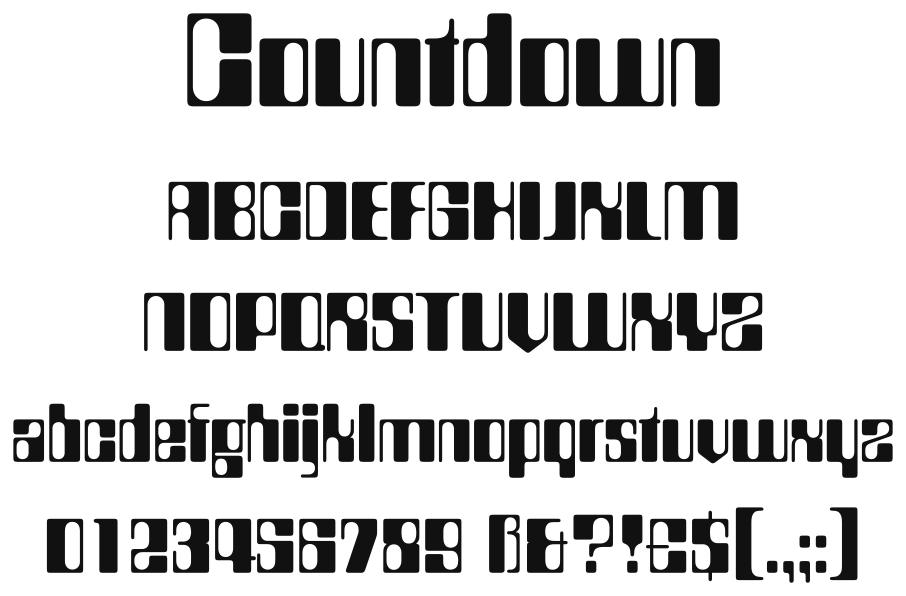
- 書体名: Countdown
- ファウンドリ: Letraset12
- 種類: ドライトランスファーのレタリングシート(紙にこすって写す文字のシート)1
- デザイナー: Colin Brignall23
- 年: 1965年(1969年ごろとする資料もある)
Letraset のカタログ(1984年・1987年)は、見本に「Countdown」「Letraset © 1965」と記す14。
一方、1972年の欧文書体集 Lettera 4 は「COUNTDOWN (ca. 1969); Letraset Instant Lettering」とし、1969年ごろのものとする5。
トニー・セダン『20世紀デザイン』(原書2014年、訳書2016年)は、Countdown を「乾式転写レタリングのレトラセット社のオリジナルとして特別にデザインされた最初の書体」とし、すぐに飽和状態といえるほど普及したこともあって、1960年代をもっともよく表すフォントの一つとする6。Lewis Blackwell『20th-Century Type』も、Letraset が自社のデザインで出した書体の「最初」を Countdown とする7。一方、Letraset のデザイン部門にいた英国の書体デザイナー Dave Farey は、Fred Lambert の Compacta(1963年)を Letraset の最初のオリジナルとしている89。
Countdown をまねた写植(写真植字)の書体もあった。Fonts In Use によれば、Lettergraphics の1976年のカタログと、Fürst のカタログに、「Digital」という名で載っている2。
デザイナー
Colin Brignall は、写真の仕事から書体の世界に入った。Dave Farey によれば、新聞のファッション・広告の写真を6年撮っていた8。Michael Dawson『The Field Guide to Typography』は、Letraset に入ったのを1964年とする10。Luc Devroye によれば、1980年に Letraset のタイプディレクターになった11。
ほかの書体に、Aachen(1969年)、Harlow(1977年)、Romic(1979年)、Corinthian(1981年)、Edwardian(1983年)などがある11。
字形
中田功『レタリング入門 アルファベット』(1983年)は、「Count down(秒読み)」として大文字・小文字・数字の大きな見本を載せ、太いステムと細いステムを使い分けて四角い形にまとめた書体で、「コンピュータ標示の字体を意識して上手にデザインされている」とする。太いステムは字によって左にも右にもなり、似た形の字を区別するために上半分と下半分のステムの太さを入れ替えている。斜めの線は抑えられていて、例外は V・Z と数字の7のみだという12。
『世界のレトロフォント大事典』は、第7章「高度成長と月面着陸」で、Countdown を「宇宙時代のディスプレイフォント」の例に挙げ、「この時代、数々のディスプレイフォントが宇宙旅行に大きな影響を受けて開発された。メカニカルな造形と線幅のバリエーションが際立つ」とする13。Zachary Whalen の博士論文『The Videogame Text』は、角の内側と外側を丸めて、ブラウン管の画面の光の滲みをまねた形が、この書体の特徴の一つだとする14。
Simon Loxley は、Letraset が1971年に出した Data 70 について、未来的な書体の市場の隙間を埋めるためのもので、その隙間は Countdown がすでに開拓していたとする15。
ビデオゲームのフォント
Fonts In Use によれば、『スペースインベーダー』(1978年)の筐体の、モニターの周りの得点の表の数字が Countdown16。
Whalen は、Atari 2600 版の『Berzerk』(1982年)の数字が Countdown をもとにしたように見えるとする。Countdown の x ハイトの変化をなくし、幅を広げているが、0 の線の太さの左右の違いや、8 の太い線と細い線の交互の並びは残っていて、Countdown の影響ははっきりしているという17。同じ字のデータを使ったゲームに、Atari 2600 の『Defender』(1981年)と『RealSports Volleyball』(1982年)がある。『Demon Attack』(1982年)、『Marine Wars』(1983年)、『Pooyan』(1982年)にも、Countdown に似た字がある1418。

ナムコの『ゼビウス』(1983年)のゲームフォントは、Countdown を参考にして作られた1920。
デジタルフォント
ITC(Monotype)が、デジタル版を MyFonts で販売している21。フォントの説明文は、Colin Brignall が1965年にデザインし、Letraset が出した「bizarre computer style」の書体で、長いあいだコンピューターや初期のハイテクを表す書体とされてきたが、今はレトロな目で見られているとする3。
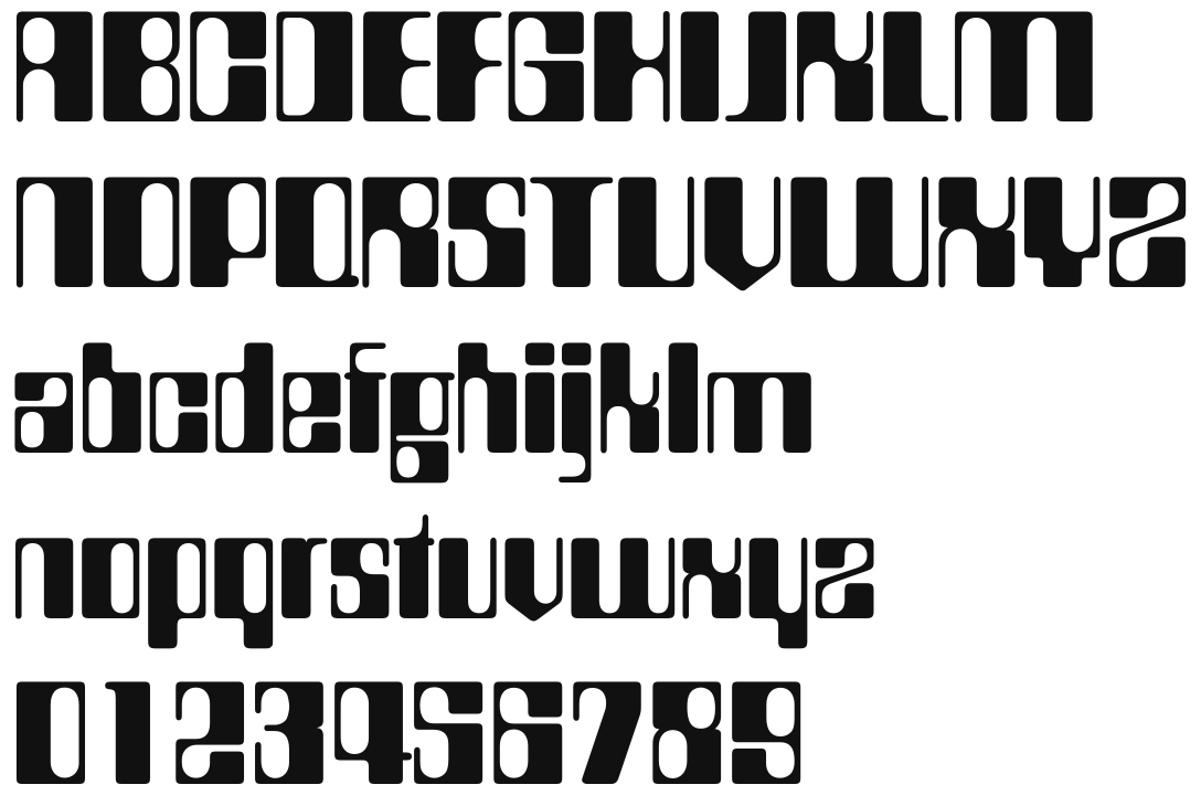
Elsner+Flake・Scangraphic・Linotype も Countdown のデジタル版を出していたが、MyFonts での販売は終了した22。
参考資料
Graphic Art Materials Reference Manual
著者 - Letraset USA
出版社 - Letraset USA
出版年 - 1984年
書体見本(p.64)。Letraset 自身のカタログ。「Countdown」「Letraset © 1965」と、シートの番号。
Letraset Communication By Design
著者 - Letraset USA
出版社 - Letraset USA
出版年 - 1987年
書体見本(p.59)。Letraset のカタログ。「Countdown」「Letraset © 1965」。小文字・大文字・数字・記号と、5枚のシートの番号。

レタリング入門 アルファベット
著者 - 中田功
出版社 - 美術出版社
出版年 - 1983年4月
ISBN - 4568500648
書体見本と解説(p.120)。「Count down(秒読み)」として大文字・小文字・数字の大きな見本。年とメーカーの記載はない。
世界のレトロフォント大事典
Retro Fonts 1830-1990
著者 - グレゴール・シュタヴィンスキー 編著
出版社 - ビー・エヌ・エヌ新社
出版年 - 2010年7月
ISBN - 9784861007002
解説(p.358)と書体見本(p.382)。第7章「高度成長と月面着陸」で「宇宙時代のディスプレイフォント」の例に挙げる。見本の欄外に「Countdown / Colin Brignall, 1965」と、Linotype のサイトのアドレスがある。
20世紀デザイン
グラフィックスタイルとタイポグラフィの100年史 10年単位でみるヴィンテージ・グラフィックアート
著者 - トニー・セダン 著, 長澤忠徳 監訳, 和田美樹 訳
出版社 - 東京美術
出版年 - 2016年9月
ISBN - 9784808710668
1960年代の書体の一覧(p.159)と、解説・見本(p.161)。見本は Elsner+Flake の版。
リンク
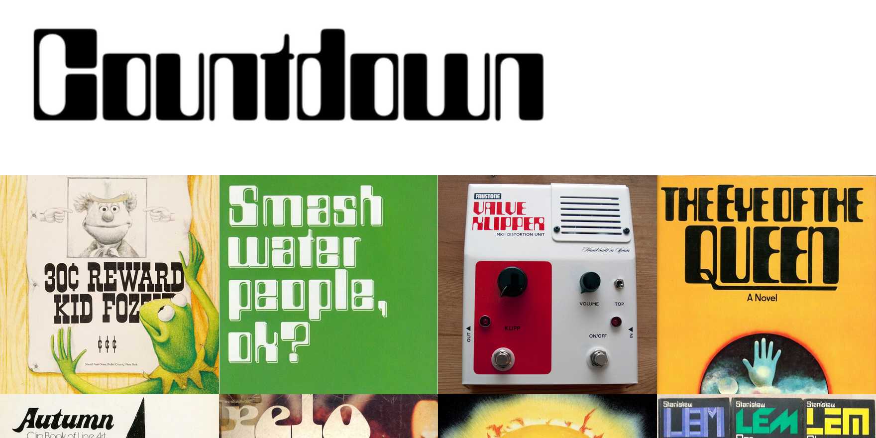
Countdown in use
Designed by Colin Brignall for Letraset in 1965. [Daines 2016] Shown in Lettera 4 (1972). Catalogs by Lettergraphics (1976) and Fürst show a phototype copy named Digital. Alexey Kustov added a Cyrillic version (TypeMarket, 1993).
Colin Brignall
Colin Brignall. Type design information compiled and maintained by Luc Devroye.
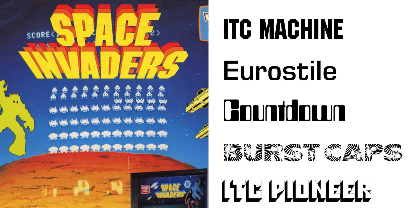
Space Invaders promotional flyers and cabinet art
From Wikipedia: Space Invaders is a 1978 shoot 'em up arcade game developed by Tomohiro Nishikado. It was manufactured and sold by Taito in Japan, and licensed to the Midway division of Bally for overseas distribution. Space Invaders was the first fixed shooter and set the temp
Countdown Font | Webfont & Desktop | MyFonts
Welcome to MyFonts, the #1 place to download great @font-face webfonts and desktop fonts: classics (Baskerville, Futura, Garamond) alongside hot new fonts (TT Fellows, Hernandez Bros,Phonk Sans).
出典・注
-
Letraset USA『Letraset Communication By Design』1987年、59ページ(「Countdown」「Letraset © 1965」。シートの番号 112-72-CN・112-72-L・112-42-CLN・112-36-CLN・112-24-CLN) ↩ ↩2 ↩3
-
Fonts In Use「Countdown」(2026年11月4日閲覧。「Designed by Colin Brignall for Letraset in 1965. [Daines 2016]」「Catalogs by Lettergraphics (1976) and Fürst show a phototype copy named Digital.」) ↩ ↩2 ↩3
-
ITC の Countdown のフォントファイル(Countdown.otf)の name テーブル(「Copyright © 2016 Monotype ITC Inc. All rights reserved.」、Version 2.001、デザイナー Colin Brignall。説明文「Designed by Colin Brignall in 1965, this somewhat “bizarre computer style” typeface was originally released by Letraset. Over the decades, designers have assumed that Countdown was synonymous for almost anything having to do with computers or the first years of hi-technology. Today, though, Countdown is viewed with more of a retro eye.」) ↩ ↩2
-
Letraset USA『Graphic Art Materials Reference Manual』1984年、64ページ(「Countdown」「Letraset © 1965」。シートの番号 112-72-CN・112-72-L ほか) ↩
-
Armin Haab, Walter Haettenschweiler (eds.), Lettera 4: A Standard Book of Fine Lettering, Arthur Niggli, 1972(「COUNTDOWN (ca. 1969); Letraset Instant Lettering」) ↩
-
トニー・セダン『20世紀デザイン グラフィックスタイルとタイポグラフィの100年史』長澤忠徳 監訳、和田美樹 訳、東京美術、2016年、161ページ(原書は Tony Seddon, Twentieth Century Design: A Decade-by-Decade Exploration of Graphic Style, HOW Books, 2014。「1965年にコリン・ブリグナルによってデザインされたカウントダウンは、乾式転写レタリングのレトラセット社のオリジナルとして特別にデザインされた最初の書体という肩書をもつ。」「すぐに飽和状態といえるほど普及したこともあり、この書体は1960年代を最もよく表すフォントのひとつとされている。」「ここに載せているサンプルは、オリジナルに極力近づけたエルスナー+フレイク版。」) ↩
-
Lewis Blackwell, 20th-Century Type, Laurence King, 2004(「The first, and one of the most distinctive period faces, was Countdown.」) ↩
-
Dave Farey「‘Take a gnat’s bollock off that’」Circular 6, 1996年(House Style Graphics の転載。「his first involvement with the graphic arts was through photography」「Fred Lambert designed Compacta, the first Letraset exclusive in 1963」) ↩ ↩2
-
Microsoft「Beesknees ITC font family」(Microsoft Learn、2026年11月4日閲覧。「ITC Beesknees? was created in 1972 by David Farey, a British graphic and type designer.」「A former employee of the Letraset design office」) ↩
-
Michael Dawson, The Field Guide to Typography, 2013, p.232-233(「Colin Brignall first started out in work as a fashion photographer. It was in 1964 that he joined Letraset」「His font designs include Countdown (1965)」) ↩
-
Luc Devroye「Colin Brignall」(2026年11月4日閲覧。「Countdown (1965, LED simulation face)」「In 1980 he became Type Director for Esselte Letraset」) ↩ ↩2
-
中田功『レタリング入門 アルファベット』美術出版社、1983年、120ページ(「太いステムと細いステムを使い分けて,四角い形にまとめたCount down(秒読み)とよぶこの字体は,コンピュータ標示の字体を意識して上手にデザインされている.」「この字体も先のチェックメイトのように斜画が抑制され,わずかな例外にV・Zと数字の7が目につくだけである.」) ↩
-
グレゴール・シュタヴィンスキー 編著『世界のレトロフォント大事典』ビー・エヌ・エヌ新社、2010年、358ページ ↩
-
Zachary Nathan Whalen, The Videogame Text: Typography and Textuality, University of Florida, 2008, p.235(「one of the original typeface’s defining features is the way Brignall used rounded internal and external corners to mimic the effects of halation and light buildup.」) ↩ ↩2
-
Simon Loxley, Type is Beautiful: The Story of Fifty Remarkable Fonts, Bodleian Library, 2016, p.207(「a gap they had already explored successfully with Colin Brignall’s Countdown, released in 1969」) ↩
-
Fonts In Use「Space Invaders promotional flyers and cabinet art」(2026年11月4日閲覧) ↩
-
Zachary Nathan Whalen, The Videogame Text: Typography and Textuality, University of Florida, 2008, p.234(「the shapes of the numerals in Berzerk appear to be adapted from Countdown, a typeface Colin Brignall designed in 1965 for Letraset.」「the typeface’s influence on Berzerk’s numeracy is clear.」) ↩
-
Zachary Nathan Whalen, The Videogame Text: Typography and Textuality, University of Florida, 2008, p.236(「a character set similar to Countdown appears in Demon Attack (1982), Marine Wars (1983), and Pooyan (1982)」) ↩
-
遠藤雅伸「THE MAKING OF XEVIOUS」p.6(「「ゼビウス」がなければ「ポケモン」は生まれなかった!?」電ファミニコゲーマー、2016年2月8日、5ページ目の画像)。「ゲーム中のアルファベットもナムコ伝統の「アタリ文字」から「カウントダウン」という書体に近いものとなった。」 ↩
-
EvezooEND(遠藤雅伸氏)の書き込み(「XEVIOUSを懐かしむ」2ちゃんねる レトロゲーム板、446、2001年3月16日。Wayback Machine の保存版)。「アタリ文字が使われていない」という問いに「画一的な因習を打破する意味でも、カウントダウンという書体にしてみました。もともとボクは、フォントデザインなどが好きだし得意なのです。」 ↩
-
「Countdown Font」MyFonts(2026年11月4日閲覧。「Countdown Std Regular」、ITC、Colin Brignall) ↩
-
MyFonts の旧ページ(Wayback Machine の保存版)。Elsner+Flake「Countdown EF」(2008年4月6日。「First seen on MyFonts: July 25th, 2001」)、Linotype「Countdown」(2013年5月14日。「MyFonts debut: May 25, 2006」)、Scangraphic「Countdown SH」(2015年10月3日。「MyFonts debut: Nov 29, 2004」) ↩