
MICR の書体 E-13B と、Moore Computer・Data 70 などの MICR 書体は、字の一部を太くした部分が特徴。決まった呼び方は見当たらず、資料ごとに呼び方が違う。
太い部分がある理由
E-13B の字は、0.013インチ角のマス目を横7×縦9に並べた上に設計されている。細い線の太さは1マス、太い線は2マス1。
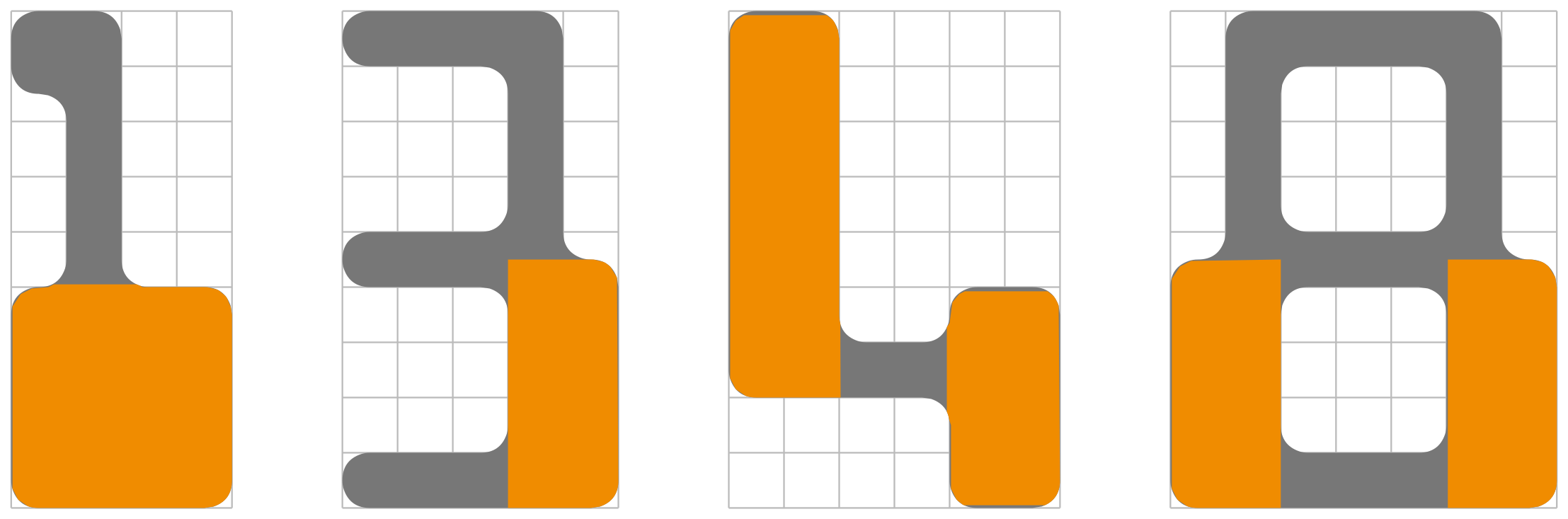
読み取り装置は、磁化した文字を読み取りヘッドの下に通す。線の縁がヘッドを通るたびに磁束が変わり、波形にピークができる2。波形は文字の高さの方向の面積を微分した形に比例し3、波形でわかるのは縦の線の位置だけ4。太い線の位置が字ごとに違うので、字が多少かすれていても、字ごとに見分けられる波形が出る5。仕組みの詳細は「MICR」と「E-13B」の記事にまとめた。
Zachary Nathan Whalen の博士論文『The Videogame Text』(2008年)は、MICR 書体の太い部分を、機械で読み取る技術の名残を見た目のために付けたもので、コンピューターや機械を連想させるとしている6。
E-13B での呼び方
( )内は参考訳。
| 呼び方 | 資料 | 原文 |
|---|---|---|
| asymmetrical rectangular slabs(左右非対称な長方形の厚板) | Whalen の博士論文(2008年) | E-13B, consists of simple, geometric forms adorned with asymmetrical rectangular slabs5 |
| asymmetrical enlargements(左右非対称に太くした部分) | 同 | the asymmetrical enlargements mainly appear on the 1, 3, 4 and 8 of E-13B7 |
| slab serif(厚板状のセリフ) | 同(E-13B の 1) | E-13B’s 1 prominently features an abnormally large slab serif8 |
| heavy(太い) | 英語版 Wikipedia「Westminster (typeface)」(2017年の版) | The weight of strokes in the characters can be recognised as “light” or “heavy”9 |
| thick stroke(太い線) | オーストラリアの決済業界の団体 AusPayNet の MICR の技術仕様書(2017年) | A thin stroke is one square wide and the thick stroke is two squares wide.1 |
E-13B の規格(米国の ANSI X3.2、国際規格 ISO 1004-1)は、字の形を寸法入りの図で決めている。本文は線を「horizontal bars」「vertical bars」(横・縦の線)と書くだけで、太い線と細い線を呼び分けていない1011。
MICR 書体での呼び方
英語
( )内は参考訳。
| 呼び方 | 資料 | 対象 | 原文 |
|---|---|---|---|
| digital tumor(デジタルの腫瘍) | Typophile のフォーラムの書き込み(aluminum、2007年) | MICR 風の書体 | The ’digital tumor’ typefaces / ’digital tumor’ is just what I call it.12 |
| blocky thing(ブロック状のもの)、gigantic serif(巨大なセリフ)、floating chad(浮いた穿孔くず) | 同じスレッドの書き込み(zachwhalen、2007年) | MICR 風の書体 | that blocky thing that characterizes these fonts (is it technically a gigantic serif?)13 |
| “tumor” look(「腫瘍」のような見た目) | 同じスレッドの書き込み(Nick Shinn、2007年) | MICR 風の書体 | The blobby “tumor” look14 |
| slab(厚板) | Whalen の博士論文(2008年) | Moore Computer、Data 70 ほか | extraneous rectangular slabs / superfluous slabs615 |
| floating slab(浮いた厚板) | 同 | Moore Computer の M・N・W・0 | Moore Computer’s M, N, W and 0 (zero) include floating slabs.16 |
| tabs(つまみ) | HiLobrow の連載「Kern Your Enthusiasm」(Adam McGovern、2014年) | Data 70 | the streamlined tabs of Data 7017 |
| dots(点) | 英語版 Wikipedia「Westminster (typeface)」(2020年の版) | Moore Computer の M・N | recognisable by its dots underneath the letters M and N18 |
「digital tumor」は、Whalen が2007年7月に Typophile のフォーラムに立てたスレッド「Researching ‘Computer’ Typefaces」に出てくる。aluminum が MICR 風の書体を「The ’digital tumor’ typefaces」と書き、この部分の名前を考えていた Whalen は、標準の名前がないのなら「digital tumor」も候補だと返した。aluminum は、自分でそう呼んでいるだけで、専門用語があるかは分からないと答えている1213。翌2008年の博士論文は、この部分を「slab」と書き、「extraneous rectangular slabs」(余分な長方形の厚板)の脚注で、Typophile の書き込みが「digital tumors」と呼んでいると紹介している15。
日本語
| 呼び方 | 資料 | 対象 | 原文 |
|---|---|---|---|
| 3種類の太さの直線 | 稲田茂『日本字フリースタイルのエレメント』(1971年) | 和文の「コンピュータ文字」 | 根本的には3種類の太さの直線の組み合せです19 |
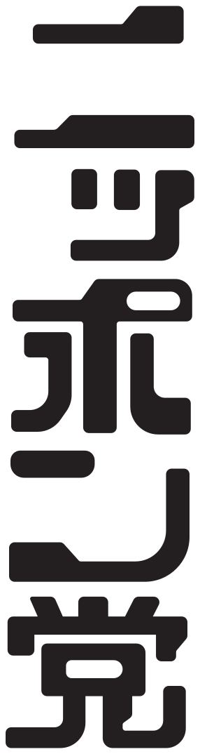
| コブ | 稲田茂『日本字フリースタイル700 II』(1976年) | 描き文字「ニッポン党」(830) | コブの作り方を注意しないと不安定な文字になる危険性がある2021 |
| 太い細い | 稲田茂『日本字フリースタイル・コンプリート』(作例は1976年) | 描き文字「超音波処理」(882) | 太い細いをはじめにカッチリと決めてかからないと変な書体になる22 |
| 太い部分 | 『アイデア』352号(2012年) | グロブダー・オメガファイターの書体(Data 70 系) | 1ドットの細い部分と2ないし3ドットの太い部分の2種類のストローク2324 |
| 変則的なステム(縦画)の太さ | 大曲都市『アーケードゲーム・タイポグラフィ』(2020年。英語の原著の井原恵子による訳) | MICR 書体 | 変則的なステム(縦画)の太さも比較的容易に再現できた25 |
| 太さが段違いになったステム(縦画) | 同 | 『スペースポジション』の書体 | 太さが段違いになったステム(縦画)を、内側ではなく外側に肉付けしている26 |
「コブ」は、稲田茂が、自分の描いた MICR 書体風の和文の描き文字「ニッポン党」の説明で使った語。表のほかの日本語の資料は「太い部分」「太さ」のように、線の太さで説明している。『日本字フリースタイル・コンプリート』にある MICR 書体風のほかの4例(「超音波処理」など)のトレースは「『日本字フリースタイル・コンプリート』の MICR 書体」にまとめた。
出典・注
-
Australian Payments Network, Magnetic Ink Character Recognition (MICR) Technical Specifications, Version 3.3.2, 2017, p.8(「on a 7 x 9 grid of 0.013 inch squares. A thin stroke is one square wide and the thick stroke is two squares wide.」) ↩ ↩2
-
Xerox Corporation, Generic MICR Fundamentals Guide, 2003, p.5-4「Waveform generation」(「as the character passes the read head, edge A generates a change in magnetic flux, producing peak A of the waveform. There is no change in flux as the character between A and B passes the head.」) ↩
-
坂井利之「文字読取装置と音声用装置」『情報処理』6巻6号、情報処理学会、1965年11月、352ページ(「文字の中には磁性材料が入っていて,この高さ方向の面積の微分波形に比例したものが出力波形になっている.」) ↩
-
Xerox Corporation, Generic MICR Fundamentals Guide, 2003, p.6-24(「Waveforms measure only vertical stroke locations, while optical standards apply also to horizontal strokes.」) ↩
-
Zachary Nathan Whalen, The Videogame Text: Typography and Textuality, University of Florida, 2008, p.63(「E-13B, consists of simple, geometric forms adorned with asymmetrical rectangular slabs」「the variability of the slab location among individual letterforms ensures that even degraded type will yield a sufficiently distinct magnetic waveform in order to be properly read.」) ↩ ↩2
-
Zachary Nathan Whalen, The Videogame Text: Typography and Textuality, University of Florida, 2008, p.70-71(E-13B・Moore Computer・Data 70・Orbit-B・Westminster について「the presence of superfluous slabs adorning many of the forms. As a vestige of a technology for machine-reading, the presence of these slabs for aesthetic reasons signifies an association with computing and machinery」) ↩ ↩2
-
Zachary Nathan Whalen, The Videogame Text: Typography and Textuality, University of Florida, 2008, p.66(「each alphabetic character Moore Computer includes at least one exaggerated slab, whereas the asymmetrical enlargements mainly appear on the 1, 3, 4 and 8 of E-13B.」) ↩
-
Zachary Nathan Whalen, The Videogame Text: Typography and Textuality, University of Florida, 2008, p.67(「While E-13B’s 1 prominently features an abnormally large slab serif, Newman has replaced this with the uniform slab present in each Data 70 character.」) ↩
-
「Westminster (typeface)」英語版 Wikipedia。この文は Andy Dingley による2017年1月12日の版で加わった(出典は付いていない。2026年11月20日閲覧) ↩
-
American National Standards Institute, ANSI X3.2-1970 (R1976) Print Specifications for Magnetic Ink Character Recognition, 3.2 Dimensions(「Detailed dimensions and the reference center lines of the printed characters for Strokes 0 through 13 are shown in Figs. 1 through 14.」「Width of horizontal and vertical bars: 0.013 inch.」) ↩
-
ISO 1004-1:2013, Information processing — Magnetic ink character recognition — Part 1: Print specifications for E13B, 2.2・5.5(「The minimum horizontal bars width is 0,279 mm. This minimum dimension does not apply to vertical bars」「All dimensions on figures below are in millimetres.」) ↩
-
aluminum の書き込み(2007年7月30日・31日)。「Researching ‘Computer’ Typefaces」Typophile(Internet Archive の2007年12月14日の保存版)(「The ’digital tumor’ typefaces we originally designed for OCR…mainly at banks.」「Yea, ’digital tumor’ is just what I call it. No idea if/what it’s actual technical term would be.」) ↩ ↩2
-
zachwhalen の書き込み(2007年7月30日)。同じスレッド(「aluminum: I’ve been trying to come up with a name (assuming there isn’t already a standard one) for that blocky thing that characterizes these fonts (is it technically a gigantic serif?), and “digital tumor” is certainly in the running now. I’ve also been considering “floating chad.”」)。スレッドを立てたのも zachwhalen(Zachary Nathan Whalen。2007年7月30日) ↩ ↩2
-
Nick Shinn の書き込み(2007年12月11日)。同じスレッド(「The blobby “tumor” look may relate to printed circuit boards and metal solder tabs — both quite graphic — rather than the requirements of optical character recognition.」) ↩
-
Zachary Nathan Whalen, The Videogame Text: Typography and Textuality, University of Florida, 2008, p.55(「The mostly rectilinear forms of the letters and the inclusions of extraneous rectangular slabs create a sense of technological intrusion」。注1「One commenter on the forums at Typophile.com refers to these unnecessary forms as “digital tumors” (aluminum).」) ↩ ↩2
-
Zachary Nathan Whalen, The Videogame Text: Typography and Textuality, University of Florida, 2008, p.89, 図2-25 の説明(「Figure 2-25. Moore Computer’s M, N, W and 0 (zero) include floating slabs.」) ↩
-
Adam McGovern「Kern Your Enthusiasm (2)」HiLobrow、2014年8月2日(「Hence the streamlined tabs of Data 70, like chic, TV-screen-cornered descendants of the blobs of ink and quill.」。2026年11月20日閲覧) ↩
-
「Westminster (typeface)」英語版 Wikipedia。この文は ZoeB による2020年2月9日の版で加わった(2026年11月20日閲覧) ↩
-
稲田茂『日本字フリースタイルのエレメント』ダヴィッド社、1971年、p.172「コンピュータ文字」(「描く人の主観によってアレンジの仕方が多少違ってきますが、根本的には3種類の太さの直線の組み合せです。」) ↩
-
稲田茂『日本字フリースタイル700 II』(国立国会図書館の書誌では『日本字フリースタイル700 2』)ダヴィッド社、1976年、p.34(国立国会図書館デジタルコレクション 20コマ。送信サービスで閲覧可能)。「830・コブの作り方を注意しないと不安定な文字になる危険性がある」 ↩
-
稲田茂『日本字フリースタイル・コンプリート たのしい描き文字2100』誠文堂新光社、2013年、p.195(「830 コブのつくり方を注意しないと不安定な文字になる危険性がある」)。作品番号711〜1410は『日本字フリースタイル700 II』(ダヴィッド社、1976年)から採録したもの(同書 p.6) ↩
-
稲田茂『日本字フリースタイル・コンプリート たのしい描き文字2100』誠文堂新光社、2013年、p.204(「882 太い細いをはじめにカッチリと決めてかからないと変な書体になる」) ↩
-
アイデア 文・構成、藤本“ANI”健太郎 執筆協力「8×8ピクセルの宇宙:ゲームフォントの世界(Univers of 8x8 Bitmap: World of Video Game Font)」『アイデア』352号、誠文堂新光社、2012年5月、134ページ(『グロブダー』の書体。「前出の2書体と比べて,太い部分が3ドット幅となり,元書体の特徴が誇張されている。」) ↩
-
同、135ページ(『オメガファイター』の書体。「それまでは1ドットの細い部分と2ないし3ドットの太い部分の2種類のストロークで描かれていた「Data 70」再現に,中間の太さを取り入れて1,2,3ドットの三段階構成としたところが特徴。」) ↩
-
大曲都市『アーケードゲーム・タイポグラフィ ビットマップ書体の世界』(井原恵子 訳、グラフィック社、2020年)p.130(「MICR書体デザインの四角い形はビットマップのグリッドと相性がよく、変則的なステム(縦画)の太さも比較的容易に再現できた。」) ↩
-
大曲都市『アーケードゲーム・タイポグラフィ ビットマップ書体の世界』(井原恵子 訳、グラフィック社、2020年)p.133(『スペースポジション』。「太さが段違いになったステム(縦画)を、内側ではなく外側に肉付けしているのは、斜体に見せるシンプルで上手な技だ」) ↩
-
トレースは、スキャンした字の輪郭をもとに、辺を水平・垂直と、いくつかの決まった傾きの斜めにそろえたうえで、元の字と見比べて、必要な所を手で直したもの。描き文字の揺れや印刷のにじみはならしてあり、元の字そのままではない ↩