日本語の記事
2020年代
「コンピューターっぽい」書体 “Westminster”|しじみ |デザインを語るひと
ビジネスに使えるデザインの話 ビジネスにデザインの知識はけっこう使えます。苦手な人も多いから1つ知るだけでもその分アドバンテージになることもあります。noteは毎日午前7時に更新しています。 ビジネスに使えるデザインの話|しじみ |デザインを語るひと|note デザイナーではないひとに向けたデザインの話。デザインについての知識は、教養としてだけでなく、ビジネスにおいてデザインやブラ note.com 書体のはなしマガジン 書体系の記事はこちらのマガジンにまとめています。 書体のはなし|しじみ |デザインを語るひと|note 書
デザインを毎日解説している人の note で、Westminster だけを紹介している。Leo Maggs が E-13B をもとに作ってから、Microsoft のフォントになるまでを短くまとめ、レコードや本の使用例の画像を載せている
世界で一番利用されているフォント|hide
世界で最も使用されているとか、世界で最も頻繁に利用されているフォントは何かという質問には、よっぽど気の狂ったへそ曲がりでもなければ誰に聞いてもたいていは、まぁ概ねヘルベチカという答えが返ってくるはずだ。多少気の利いた人か詳しい人にでも尋ねれば、Helvetica以外にもArial、Avenir、Baskerville、Bodoni、Calibri、Cambria、Courier、Didot、DIN、Franklin Gothic、Frutiger、Futura、Garamond、Gilroy、Gotham、Inter、Minion、Noto、Roboto、Times New Roman
窓辺の小石(44) Big Ben Strikes Again
古い映画やテレビドラマでコンピュータを扱うとき、奇妙な形の文字フォントが使われることがある。これは、Westminsterなどのコンピュータに関連する書体だ。ここでは仮に「コンピュータ書体」と呼ぶことにする。かつてはテクノロジーや未来的なイメージのために作られた書体だが、縦線の途中が膨らんでいるなど、普通の書体とちょっと違うところがある。
マイナビニュースの Windows の連載「窓辺の小石」の第44回で、筆者は塩田紳二。E-13B と CMC-7 の読み取りの仕組みから、Westminster の成り立ち、Data 70・Moore Computer までを紹介している。こうした書体を Windows Terminal やワープロで実際に使い、等幅でないことや記号が欠けていることを確かめている
2010年代
[OCR]MICR - [FORCE]
MICR[LINK]詳しくはWiki[L...
英語の記事
2020年代
(Now Go Bang!) The C64 Dead Test Font
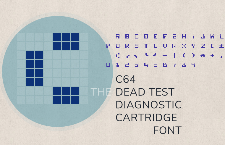
A deep dive into the font of the “Dead Test” diagnostic cartridge of the C64, including an Easter egg, a look into the implementation, and, finally, some Commodore 8-bit character ROMs for download.
ウィーンの Norbert Landsteiner のブログ。Commodore 64 の診断用カートリッジ「Dead Test」に入っているフォントを解析し、その角ばった字が E-13B から来ていることを示している。どこからも使われていない1字が、E-13B の記号「transit」だと突き止めている
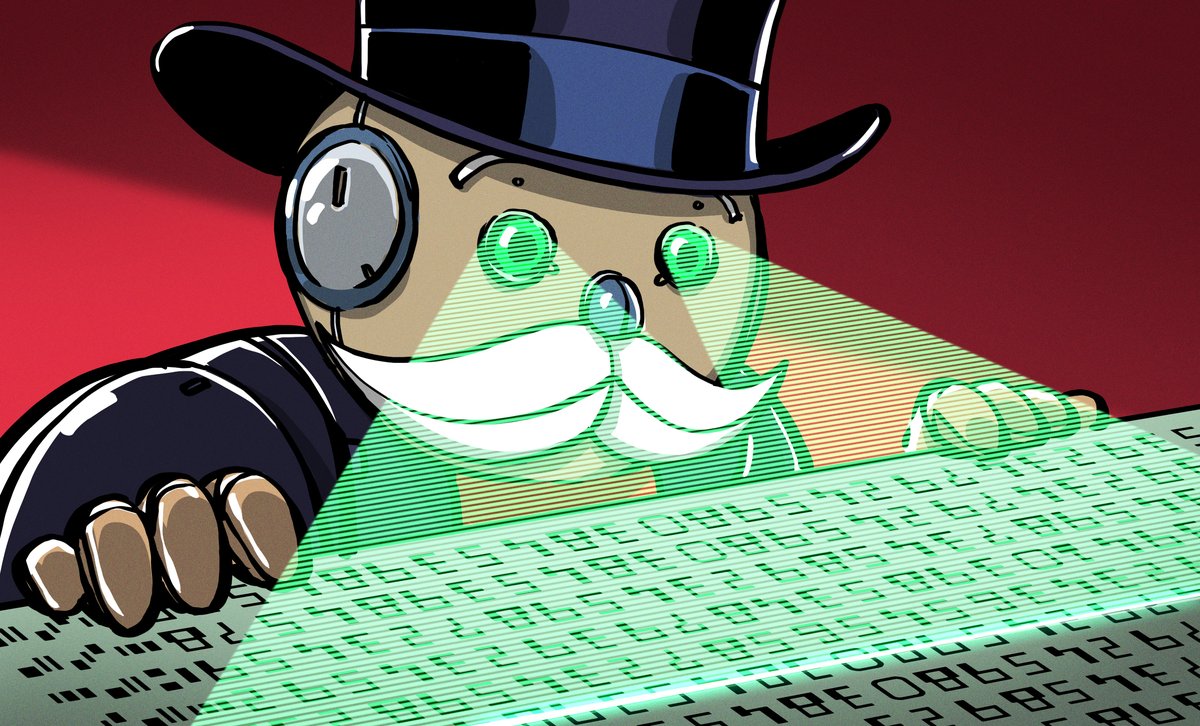
How Magnetic Fonts Twisted Up Numbers And Saved Banking Forever
If you’ve ever looked at the bottom of a bank check, you probably glanced over some strangely formed numbers? If you’re a fan of science fiction or retro computers, you’ve probabl…
ハードウェアのブログ Hackaday の記事で、筆者は Zoe Skyforest。1940年代からの小切手の処理の負担から、ABA の採用、連邦準備制度の義務化までの MICR の歴史と仕組みをまとめている。CMC-7 の例として、エンツォ・フェラーリが署名したイタリアの小切手の写真を載せている
2010年代
Computer-Age Typography: Hybrid Legibility Explains that Ubiquitous Check Font
デザインのポッドキャスト 99% Invisible のサイトの記事で、筆者は Digital Director & Producer の Kurt Kohlstedt。SRI と GE による E-13B の開発と名前の意味を、機械にも人にも読める「ハイブリッドの可読性」という見方で解説している。英字を含む MICR 書体は、数字の形からの「解釈」だと紹介している
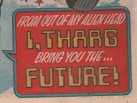
Westminster Typeface, 1964/1965
Together with Bob Newman's perhaps better known 1970 typeface Data 70, the Westminster typeface represented a significant shift in the intrusion of the digital world into the real one, and still remains a potent and evocative symbol of futurist aspirations and fears.
冷戦期の大衆文化を扱うサイト We Are the Mutants の短い解説で、筆者は Senior Editor の Richard McKenna。Westminster の経緯を Mercer Design の記事から引き、Data 70・Amelia・Countdown と並べている。1980年代後半にも、テクノ・モダンの記号として広く使われていたとする。1968〜1982年の使用例の画像が6点ある
The History of Optical Character Recognition Fonts
Optical character recognition fonts were one of our earliest tactics for teaching computers to read, one of the 20th century’s great challenges.
Battle of the MICR Fonts: Which Is Better, E13B or CMC7?
Why does the magnetic MICR printing on checks use such a weird font?
2000年代

Is there a particular reason the font for routing numbers on checks is so heinous? - Chicago Reader
Why did banks settle on that very 70s futuristic—and downright awful-looking—font as the standard typeface for the routing and account numbers on checks? Is there something inherently superior about it? If so, why isn’t it found on more official documents? —B. Yankee, via e-mail Stop right there, B. You don’t want to even use “70s” […]
Eye Magazine | Feature | Electrifying the alphabet
出典にした記事
このサイトの記事で出典にしている Web の記事。
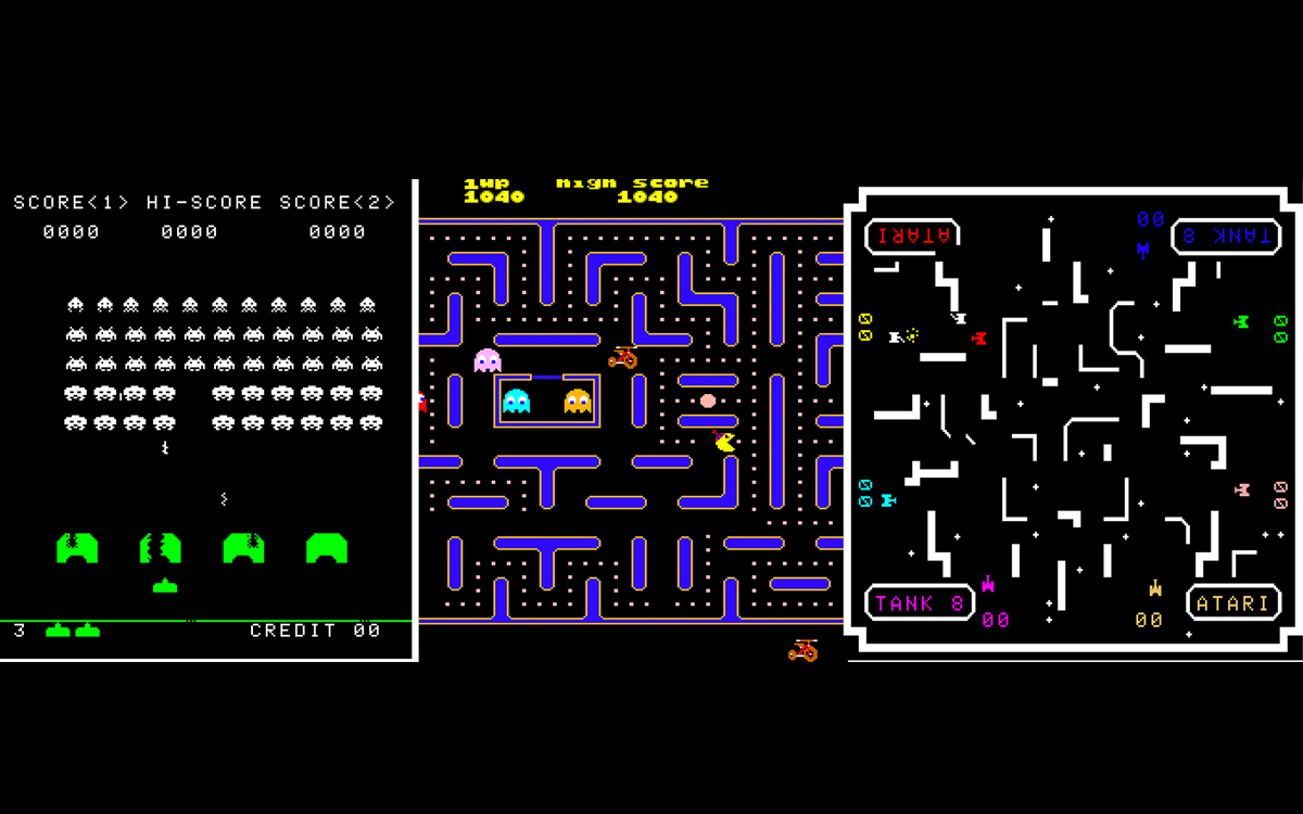
Turtles, Tron, and RayForce—Arcade Game MICR Fonts Previewed Our Space Age Future
The cheerful pop-culture visuals of arcade games form a shared lingua franca for players worldwide, meant to guide them through multilayered narratives set in imaginary universes. They also represent a beautiful and underappreciated category of outsider art. Author and senior type designer at Monoty
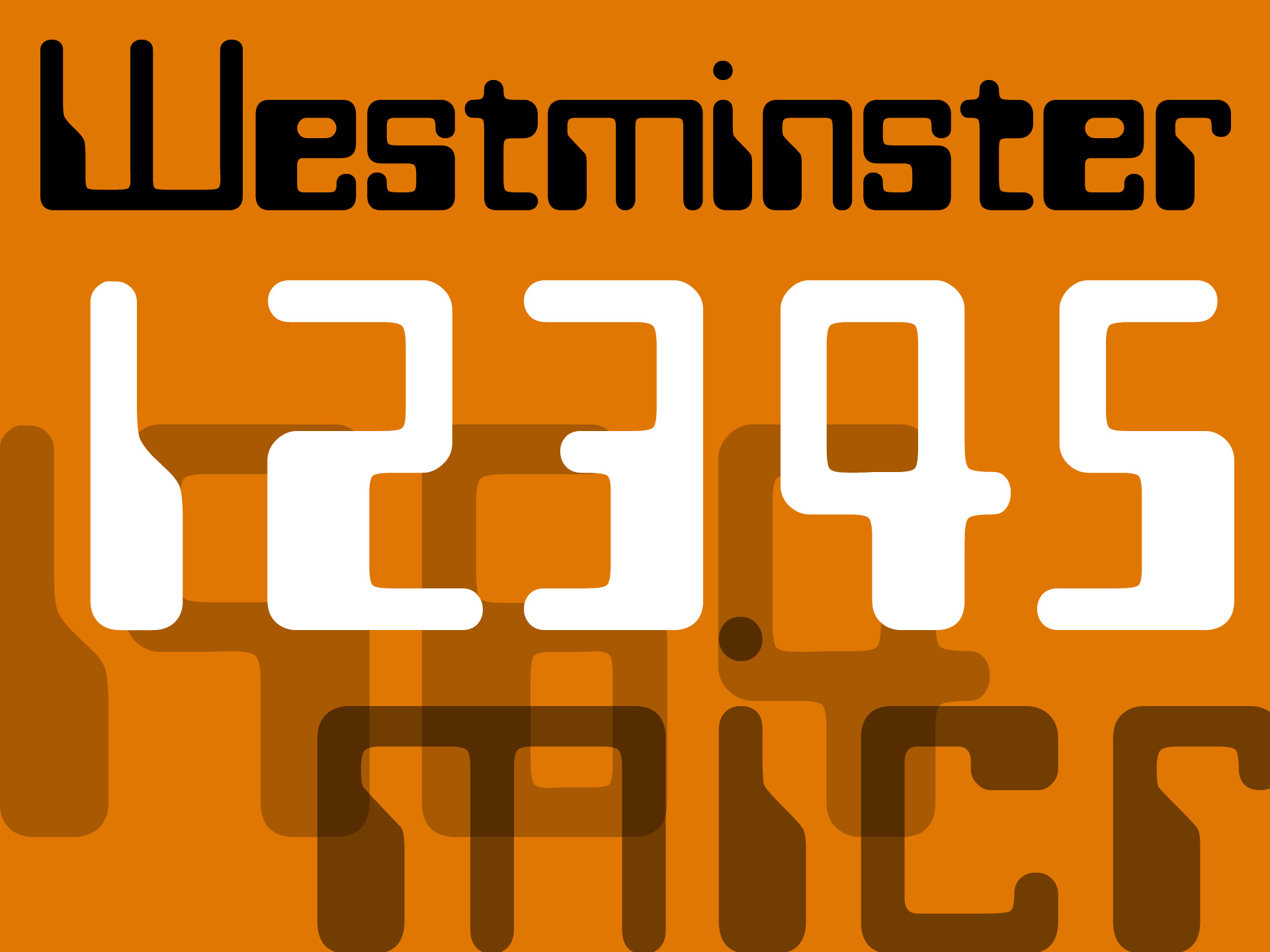
The truth about Westminster (the font!) - Mercer Design
The font Westminster was designed by Leo Maggs back in the swinging sixties and later licensed to Microsoft.
ロンドンのデザイン事務所 Mercer Design のブログで、筆者の Simon Mercer は Westminster をデザインした Leo Maggs の義理の息子。Maggs 本人が書いた経緯を載せている。雑誌の見出しを E-13B 風に描いたことから、Letraset に断られて Photoscript から出したこと、Microsoft との契約までを読める
Westminster と Data 70 の記事で、Westminster の経緯の出典にした
Kern Your Enthusiasm (2) – HILOBROW
HiLobrow の連載「Kern Your Enthusiasm」(1回に1書体を取り上げる)の1回で、筆者はコミックの原作や詩・エッセイを書いている Adam McGovern。Data 70 を1970年代の「現代」の記号として論じたエッセイで、1960年代のサイケデリックなレタリングの流れにあるとし、Futura・OCR-A と比べている
MICR 書体の太い部分の呼び方の記事で出典にした
看板や映画のタイトルなどの欧文書体を扱うサイト OVENTYPE の連載「Future Lost in Type」の最終回で、筆者は Yaha Hayashi。映画『WarGames』の画面の文字を題材にした連載で、この回は E-13B から Westminster・Moore Computer・Gemini・Data 70・Amelia・Countdown への流れをまとめている。映画・本・レコード・ゲーム機などの使用例を年代順に並べていて、ここに挙げた日本語の記事では、もっとも広く MICR 書体を扱っている。公開日はページに書かれていない。2026年7月ごろは、サイトの投稿のデータ(2026年7月23日)と、Internet Archive に6月までの保存がないことからの推定